Devil Jam
Devil Jam is a “survivor-like” game with a strong “Heavy Metal” theme that uses a unique beat system to trigger weapons and effects. It was developed by Rogueside using the Unity Engine.
I joined the team on this project later in development after finishing up Best Served Cold. I was tasked with adding additional Gameplay Design and Enemy Design.
Premise
Devil Jam is a “survivor-like” inspired by popular games like Vampire Survivors.
A unique twist is that weapons are saved in an inventory system on a 3x4 grid.
Each of the 4 columns represents a “beat” of the music, triggering all weapons and effects in that column.
Weapon, Ability and Passive Design
Having played a variety of titles in this genre, I was tasked with adding new weapons, abilities, and passive effects as well as handling the balancing of existing ones.
An “item” could belong to one of the 7 Deadly Sins that would aid the player in their fight to survive for 30 minutes and defeat “Death” at the end of their run.
Each Sin had their own theme, both visually and in terms of gameplay.
Weapons would trigger on the beat and fire off projectiles that directly affected enemies.
Abilities had no effect on their own, rather, they would alter weapons on the grid that were placed within certain nodes around this ability. For example, the “Sadist” ability would make Ranged Weapons shoot an additional projectile.
Passives would simply provide benefits under certain circumstances. They also weren’t placed in the grid but had a separate limit of 7 passives.
I designed the following “ Sins” with these themes based on their description provided by the team, which was created before I joined them:
Sloth - Slowing down enemies and enhancing a defensive playstyle.
Greed - Obtaining and spending currency would amplify power. Also, leveling up is easier.
Pride - Summoning helpful creatures to aid in battle, and dealing more direct damage.
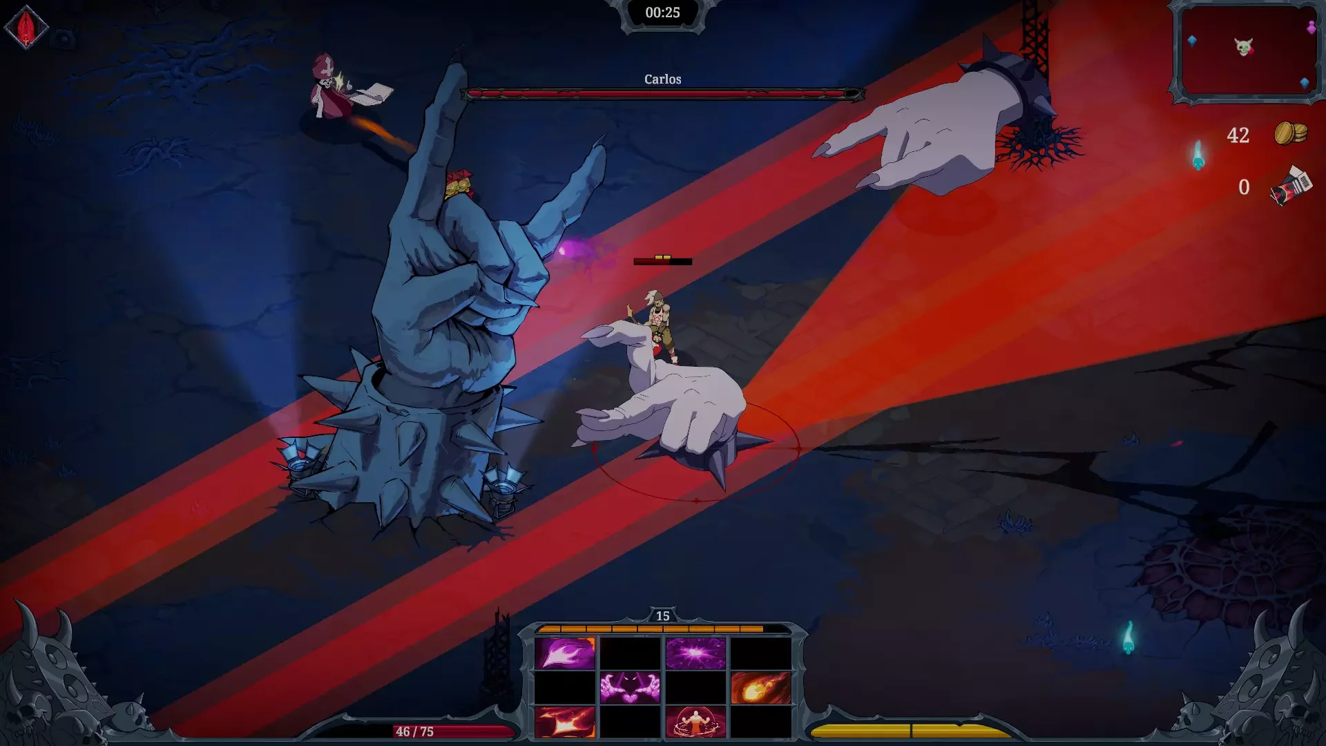
Screenshot of gameplay during an intense moment. Projectiles in yellow, purple and pink belong to the player. The Purple and Yellow projectiles represent weapons and abilities from the Greed and Pride sins.
Enemy Design
The majority of he enemies had already been designed when I joined. Due to time constraints, rather than design more, I asked the artists to create simple but clear “recolours” for these existing enemies so they could be given unique behaviour while still being distinct for the player.
For example, the “Spegg” is a simple, blue slime enemy that moves in a zig-zag pattern on the beat. Once close enough to the player, it will shift to move linearly. Using that enemy, with recolours, I added the following variants:
Orange Spegg - Stronger version of the Blue Spegg.
Red Spegg - Once it starts to follow the player, it spawns a small AoE effect around it that the player must dodge.
Chaos Spegg - Rather than follow the player or move in a zig-zag pattern, these enemies would move across the screen in a straight line.
Besides creating new enemy types, I was also responsible for handling their spawns. Devil Jam operates on a 30 minute playthrough, and every minute, different enemies would spawn. It was my responsibility to create a timeline for enemy spawns, as well as scripting certain events that would spontaneously occur and catch the player off-guard.
Events were meant to increase intensity or lower it. My job was to strike a balance between the amount of enemies, the type of enemies, the player’s expected power level at the time and finally the amount of EXP given by these enemy spawns.
A player fights off a “Ring Spawn” event that spawns in a large ring of enemies that closes in on their location. The player can try to dodge out or force open an exit through sheer damage.
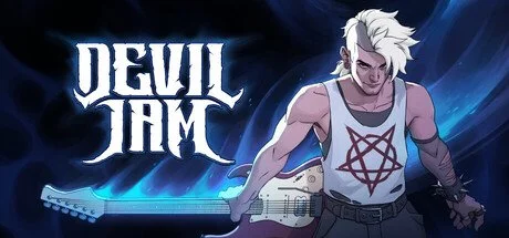
The basic sketches for Carlos’ concept. Using the hands and examples, I created the boss ideas for large AoE attacks that the player must avoid while attempting to chase the actual Boss t deal damage.
Carlos’ boss fight in action. A hand tracks the player and fire beams to their sides. Standing still will always cause these beams to miss, but moving early will result in getting hit.
Meanwhile, the hand in the center performs “the snap”, spawning cones of damage in a circular pattern that requires well-timed dashes to avoid.
Carlos is running away in the top-left. His hitbox is only attached to this entity, requiring the player to give chase.
Boss Design - Carlos
To fill out the roster of bosses, I was tasked with designing two additional bosses on top of the existing Demo boss “Meggy” and “Death”, who was the final boss still in development by the Lead Designer.
Area Denial
The first boss I designed was “Carlos”, who had very basic concept art to start from, using the theme of a menacing conductor who let his controllable hands do most of the work.
I drew inspiration from Final Fantasy XIV’s boss design. While it is an MMO, the vast majority of the mechanics are solved through movement. Since the theme of “Carlos” in the concept was “area denial”, it made sense to me to look at movement as the counter-play.
Animation Restrictions
Carlos’ attacks had to be made with a constraint on animation time, as deadlines were already getting tight. As such, I minimized the impact of Carlos himself, letting the animators focus on the hands instead. Additionally, to further reduce strain on the animations, the attacks performed by Carlos would rely more on AoE markers and VFX.
The Cowardly General
Finally, I wanted players to hate the boss, and as a bit of narrative design, the idea was to make him a cowardly general who let his hands do his dirty work. Carlos never attacks directly, instead, he continuously runs away from the player until backed into a corner. Once stuck, a hand would grab him and teleport him away. This boss is significantly easier for people with a Ranged setup than those using close range. To counteract this, I made the second boss design favour Melee builds instead.
Boss Design - Brutus
Reckless Attacks
The ideas for Brutus involved a more gimmicky fight that didn’t deviate too much from the rest of the game so the player’s mastery over mechanics still mattered.
With “Meggy” being a very stationary boss and “Carlos” using avoidant movement, I decided to approach Brutus with the idea to make him move aggressively towards the player to sort of fill up the last type of interesting behaviour. While it is the same behaviour as normal enemies, the special attacks and gimmicks would provide the interesting iterations.
Multiple Targets
I wanted a boss that had more than one target. The idea was to make him spawn entities that would heal him over time which can be destroyed to deny this healing. This resulted in a very aggressive boss chasing you while targeting his means of prolonging the fight.
VFX over Animation
Again, animation deadlines were much tighter than when designing Carlos. By making his movement his main attacks, the animators could focus on simply making a few animations that served as setup. I.e., a “power-up” animation was made that was used for two of his attacks.
Likewise, a simple swipe attacks also served dual purpose by being used for two different abilities with very different behaviour.
From there, it was a matter of working together with the VFX artist to ensure that these limited animations were accompanied by clear, interesting and satisfying visuals to give the whole fight a polished feeling.
The player fighting Brutus. The projectile he channels uses a basic “power-up” animation. At the end of the attack, Brutus will dash to the projectile and perform a basic melee swing animation to cause the fireball to explode into 4 different projectiles. Both the dash and swing animations were re-used for all his other attacks to maximize efficiency.
Balancing - Items
While the Lead Designer handled the music and the final boss fight, I was tasked with handling balancing of new and existing items, as well as enemy stats, progression and bosses.
Positive Reinforcement
A big issue that had been reported as I first tackled the balancing was that Abilities felt underwhelming. Their effect of making Weapons stronger wasn’t communicated too well.
As I examined the existing Abilities, I learned that many would grant medium buffs while also imposing some nerfs to maintain balance. During my internship at Triumph Studios, I learned from their Lead Designer that it is often better for player psychology to only communicate in positives, even if the outcome is the same.
I did a pass on all abilities to ensure that every one of them had only positive effects, which worked well as people were more inclined to pick them now that they just had positive numbers associated with them. As for the counterbalance, I opted to reduce the base stats of all weapons across the board. This ensured no nerfs were ever visible to players, while overall maintaining roughly the same power levels.
When I designed new items, I made sure to keep this philosophy up to ensure consistency.
Breathing Room
Another issue was upgrading items. Each item, when selected again, would be upgraded to the next tier. Players reported that once a weapon was fully upgraded, the game became too easy.
Initially, we started with 5 tiers of quality:
Common -> Rare -> Epic -> Mythic -> Legendary
This meant that the transition from basic item to their maximized effect had to be spread across 5 tiers. Proposals ranged from reducing the amount of EXP you receive to nerfing damage in general.
Reducing EXP would result in a strong negative feedback loop. Less EXP meant less power, and less power resulted in less kills which resulted in less EXP. Part of what makes Survivor Games fun is reaching a point of feeling very powerful, the issue here is that it was reached too soon.
Recognizing this as the root of the issue, I opted to forego changing EXP or damage on the items and instead adding two new tiers so everything remained the same but was spread out more smoothly. Now the quality would be:
Common -> Uncommon -> Rare -> Epic -> Mythic -> Legendary -> Demonic
Shifting the numbers a bit, they became more spread out. People still leveled up the same way, but power was gained at a steadier pace with identical final results.
Undone
It should be noted that shortly before release, the Lead Designer opted to undo a lot of this philosophy and reintroduce negative effects to items as I was shifted to a new project.
Negative Steam Reviews often cite a lack of balancing.
The Item selection screen. Note the “Sadist” ability being of Rare quality. The negative traits of this ability were reintroduced by the Lead Designer after I shifted to a different project.
Boss Balancing
Aside from the new bosses, old bosses also needed some attention while the Lead Designer focused on VFX and SFX implementations.
Race Against Time
A big challenge was the idea of a timer. Each boss had their own theme song, which was not designed to loop. The Lead Designer’s original idea was to have the song serve as a hard time limit that would result in a Game Over if the boss wasn’t beaten before the song ended.
Both internal and external feedback communicated clearly that some players took issue with this. People who preferred defensive playstyles felt punished as they often couldn’t meet the final DPS check.
The vision of the Lead Designer was to promote aggressive play, but this didn’t work out. In the end, we requested looping versions of the Boss themes, and removed the hard timer. Instead, I designed a “soft-enrage” system where every minute, the Boss stats would slightly increase, punishing slower play but still making it possible to complete.
Healthy Feedback
Experienced players noted that the demo boss, “Meggy” died too quickly. Meanwhile, players who didn’t play many games in the Survivors genre struggled to even reach the boss, let alone defeat her.
It turned out a lot of feedback was due to a wrong setting for the “Poison” status effect, which dealt percent based damage at a much higher value than expected. Once fixed, experienced players had a decent challenge for the boss at base difficulty.
A major issue for newer players was the requirement for Healing. They noted that without a build designed around healing, they would go down very quickly. As such, I added a few simple enemies that periodically spawned during the fight. Upon defeating them, they had a good chance of dropping a healing pick-up. This also fixed the issue.
The Sponge Issue
As development was reaching an end, we received some additional feedback from external playtesters that the final boss, “Death”, was too much of a health sponge. With his ability to heal and having a large amount of base health, I tackled the balance of this boss for which the Lead Designer didn’t have time.
A problem commonly encountered for other bosses and balancing as well, was that due to the random nature of the game, players would occasionally get incredibly unlikely and very powerful or weak builds. Once they submitted their feedback, it was taken to me with the request to buff / nerf things since a player had a negative experience even if that experience was a unique outlier.
Balancing Death was such a case, where I made sure to test multiple times and ensure that my average experience was challenging, but I did face the occasional “easy” win or even die with a weak build.
Undone
As I was moved to a different project, the Lead Designer undid these changes and made the Death boss fight incredibly long in order to make the game feel more challenging. Negative Steam reviews state the boss is simply not engaging, just a massive “health-sponge”.
The player fighting Death. In this attack, Death spawns a large amount of enemies that he pulls towards himself. Upon reaching him, the enemies are executed and he is healed for a small amount.
Death’s fight has been prolonged by the Lead Designer by giving him a large amount of Health, drawing out the fight as powerful builds could easily take him down, though this required a lot of upgrades and luck.
The original UI in the first version of the Demo. The 4 columns, 3 row grid has been squished down and inverted into a single row. Many players reported they weren’t even aware of what it represented.
The final version of the UI. The grid is more clear and represents the inventory system 1:1. The player is clearly visible in the center.
User Interface
Another supporting role I played was helping improve the User Interface and implementing the results.
Players originally struggled with the beat system as the Artist who made the original concept for the UI focused heavily on clean aesthetics and keeping as much screen space as possible.
The core mechanic of the 12-slot inventory system was basically hidden as the opted to collapse it into a very unintuitive form where the icons of the slotted items were barely readable.
I proposed a few reworks through quick prototyping, which addressed the issues above while also playtesting to ensure the bottom of the screen was still clean enough to prevent enemies from dealing damage while hidden by the UI.
The core game mechanic was received much better after implementing this new UI, as it demonstrated much better how the beat system interacted with the 12-slot inventory.